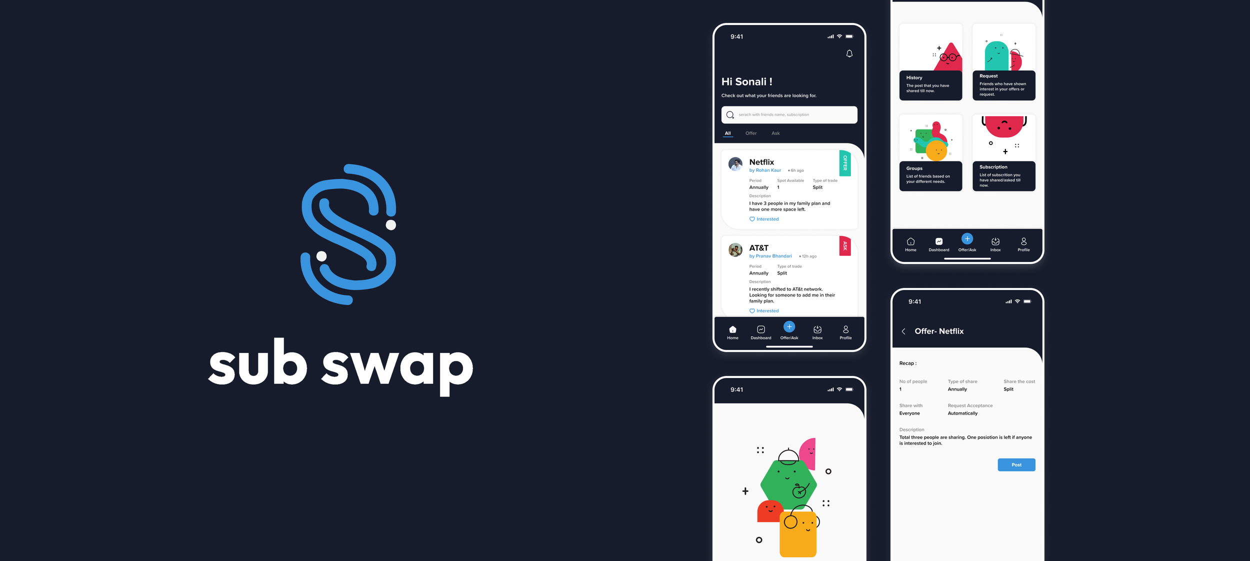
SubSwap
Asking for a subscription or sharing with your friends and family gets easier than you thought.
My Role
Solo Project
Duration
14 weeks project
Fall 2022
Mentor
Marina Terteryan
Can you relate to this? Have you ever wanted to access content across multiple platforms but found managing several subscriptions overwhelming? Or felt hesitant to ask friends or family for access, even though you know they might have what you need? It’s a tricky situation, isn’t it? You’re not alone—many are facing the same challenge.
The Context
Many young professionals and students love exploring content across streaming platforms, online learning tools, and even subscription-based services for groceries and fitness. But when it comes to managing these subscriptions, it feels like a maze. I sign up for one service, then another, and before I know it, I’m juggling payments for things I barely use. Asking friends or family to share their subscriptions seems like an easy solution, but it’s not that simple. I’ve found myself hesitating, unsure of how to ask without feeling like I’m overstepping.
One of them mentioned,
"It’d be amazing if there was a way to access what I need without feeling like I’m begging someone for their login info. It just makes things awkward."
The Challenge
How can users enjoy the content and services they love without breaking the bank or feeling uncomfortable asking friends and family for access?
The Solution
A mobile application designed to tackle the challenge of accessing multiple services affordably, it allows users to easily ask for and share subscriptions. This streamlined approach makes it simple to enjoy favorite content and services without the hassle of managing numerous accounts or feeling uncomfortable about social interactions, while fostering a sense of community and shared experiences.
Design Process
Let’s take a quick stroll through the design journey. From identifying user challenges to sketching concepts and fine-tuning the final product, here’s a behind-the-scenes glimpse if you’re ready to explore the details!
Empathize
To better understand the challenges and behaviors around subscription sharing, I conducted interviews with 8 individuals, aged 20-30, who are either full-time students or professionals living away from their home country. These interviews helped me dive into their experiences and habits regarding subscriptions.
I asked questions about:
Their home environment.
The list of subscriptions they are using and how much they are spending on it.
How much they are comfortable sharing and with whom.
Their new habit adaptation.
Insights Gained
Define
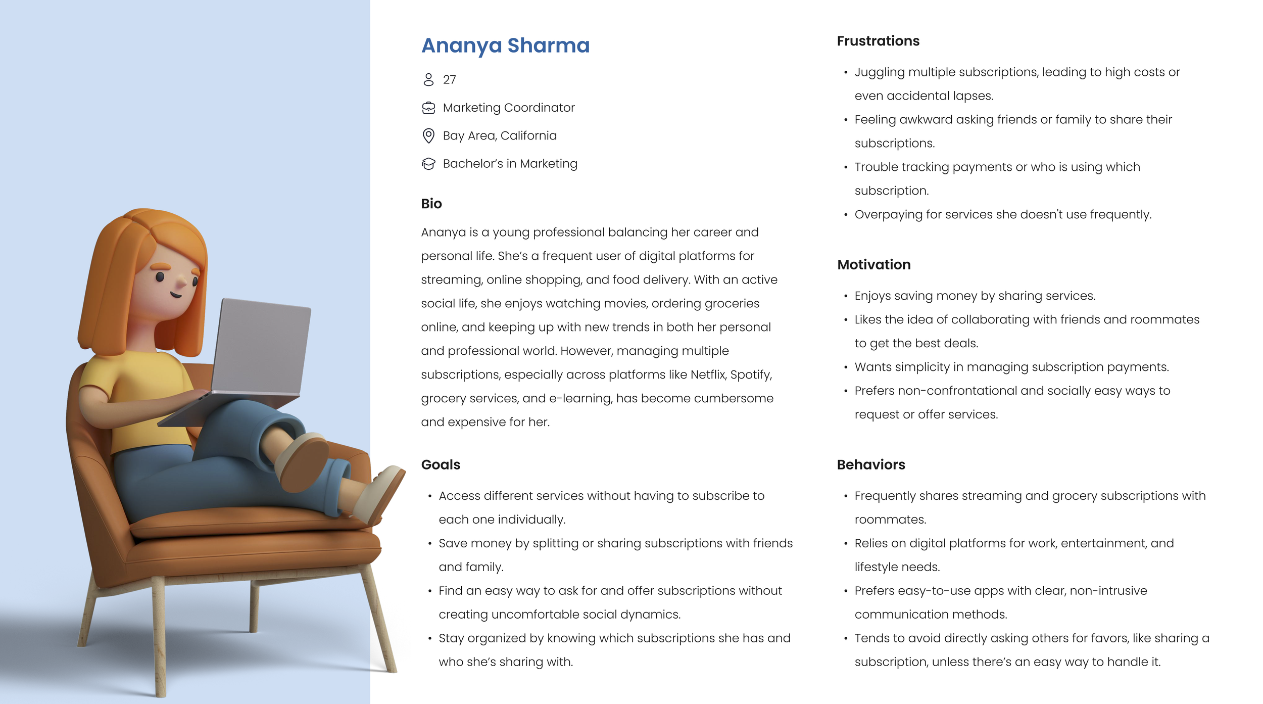
By quickly developing a user persona based on the insights from my research, I was able to pinpoint the exact problem that needs solving. This persona gave us a clear focus and direction for tackling the challenges our users face.
Ideate
During the concept development phase, I researched various platforms for sharing, such as Buy Nothing group, where users can ask for and share items within their neighborhood without any exchange of money, Comn, a platform for sharing clothes, Nuw, a platform for sharing high-end clothing items, and other sites where users can share games with each other. These apps not only connect people but also promote a sense of community and mutual assistance.
User Flow
Prototype
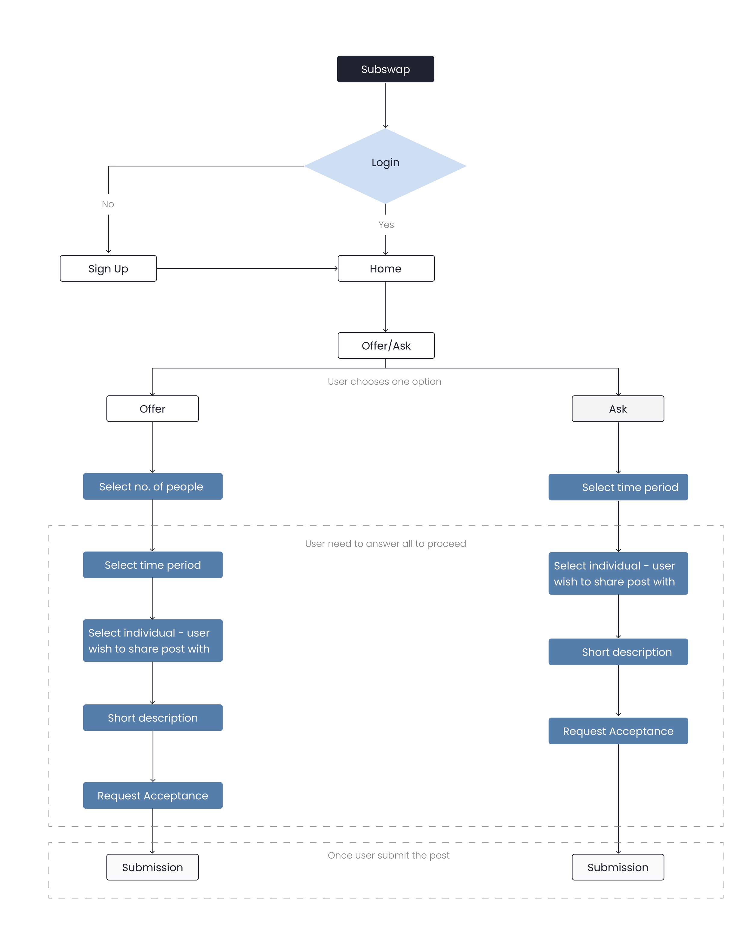
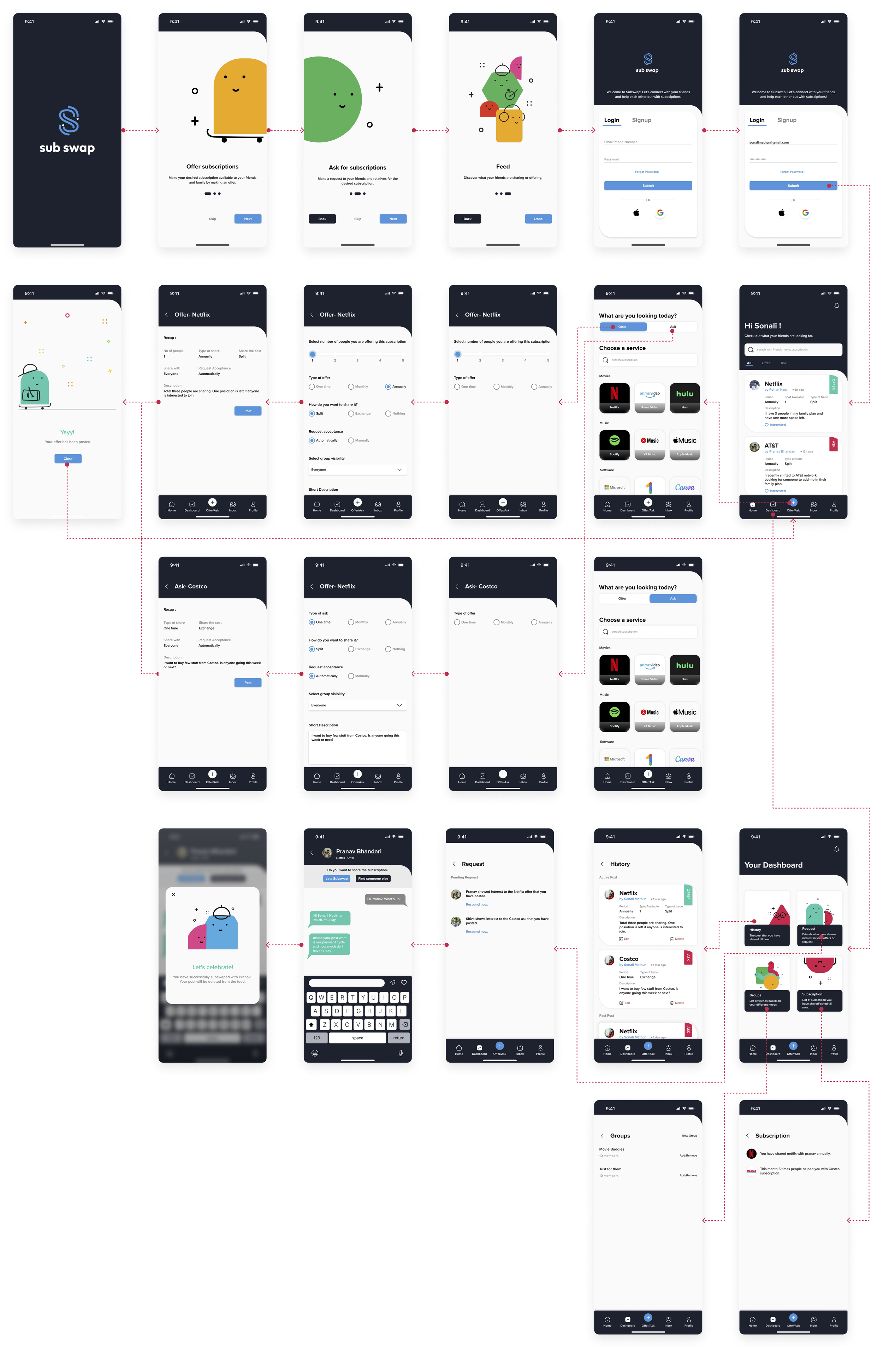
After establishing the user flow, I began by creating a paper prototype to test with users and gather feedback on its functionality. This initial testing helped me understand its effectiveness, and based on their responses, I moved forward to develop low-fidelity designs.
Wireframes
Usability Study : Findings
I conducted three rounds of usability testing to evaluate the app’s design.
In the first round, I tested a paper prototype to gauge its effectiveness and gather initial insights.
During the second round, users engaged with a low-fidelity prototype, allowing us to test the user flow and overall experience while identifying areas for improvement.
In the third round, users interacted with a mid-fidelity prototype to assess the usability and functionality of the product.
These testing phases enabled me to pinpoint and address key design issues, leading to a more refined user experience.
Simplifying the Homepage for Clarity
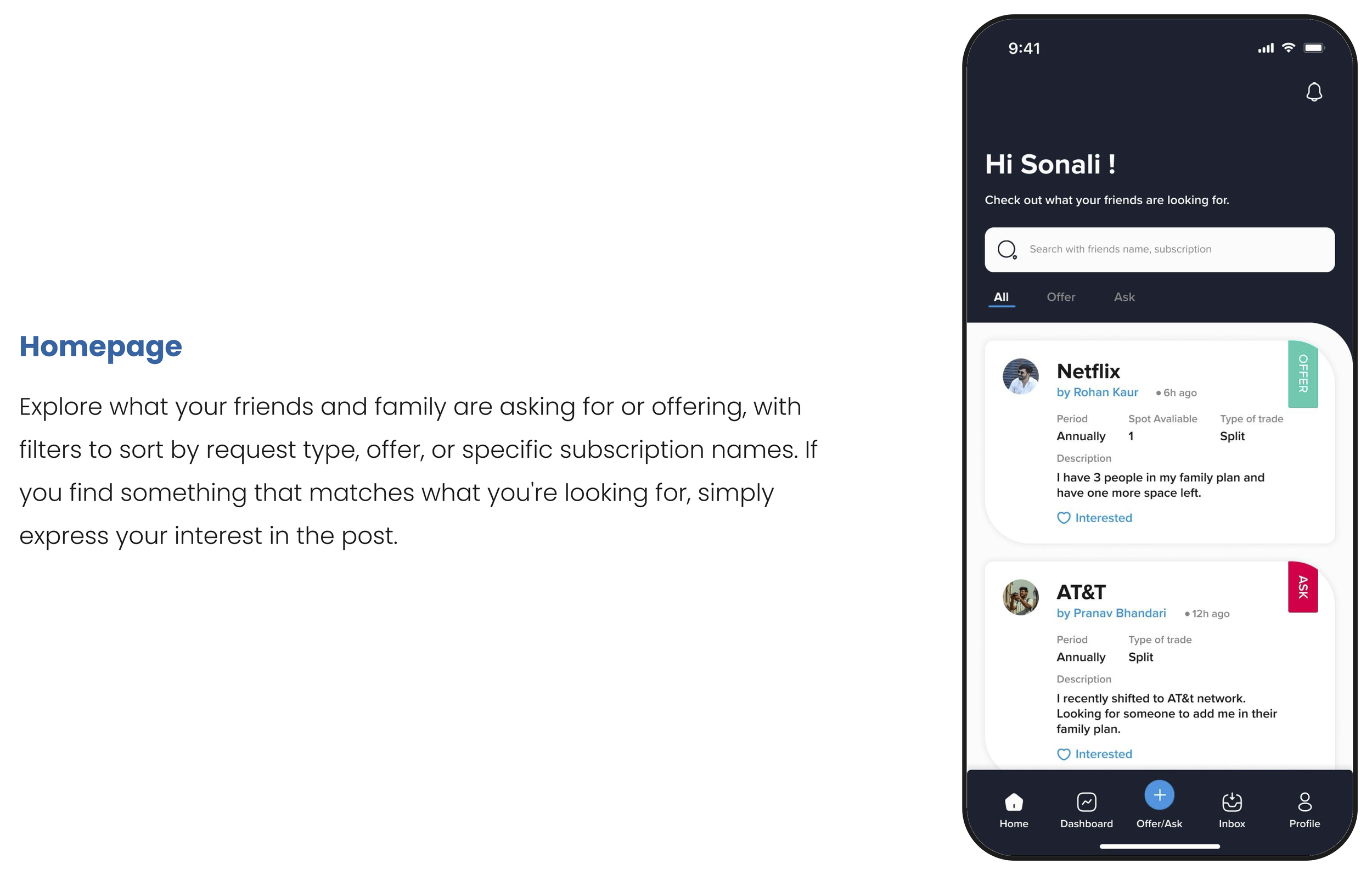
I revamped the homepage to tackle user concerns about information overload, making the feed the central focus for a cleaner, more streamlined experience.
Improving Usability through Progressive Questioning
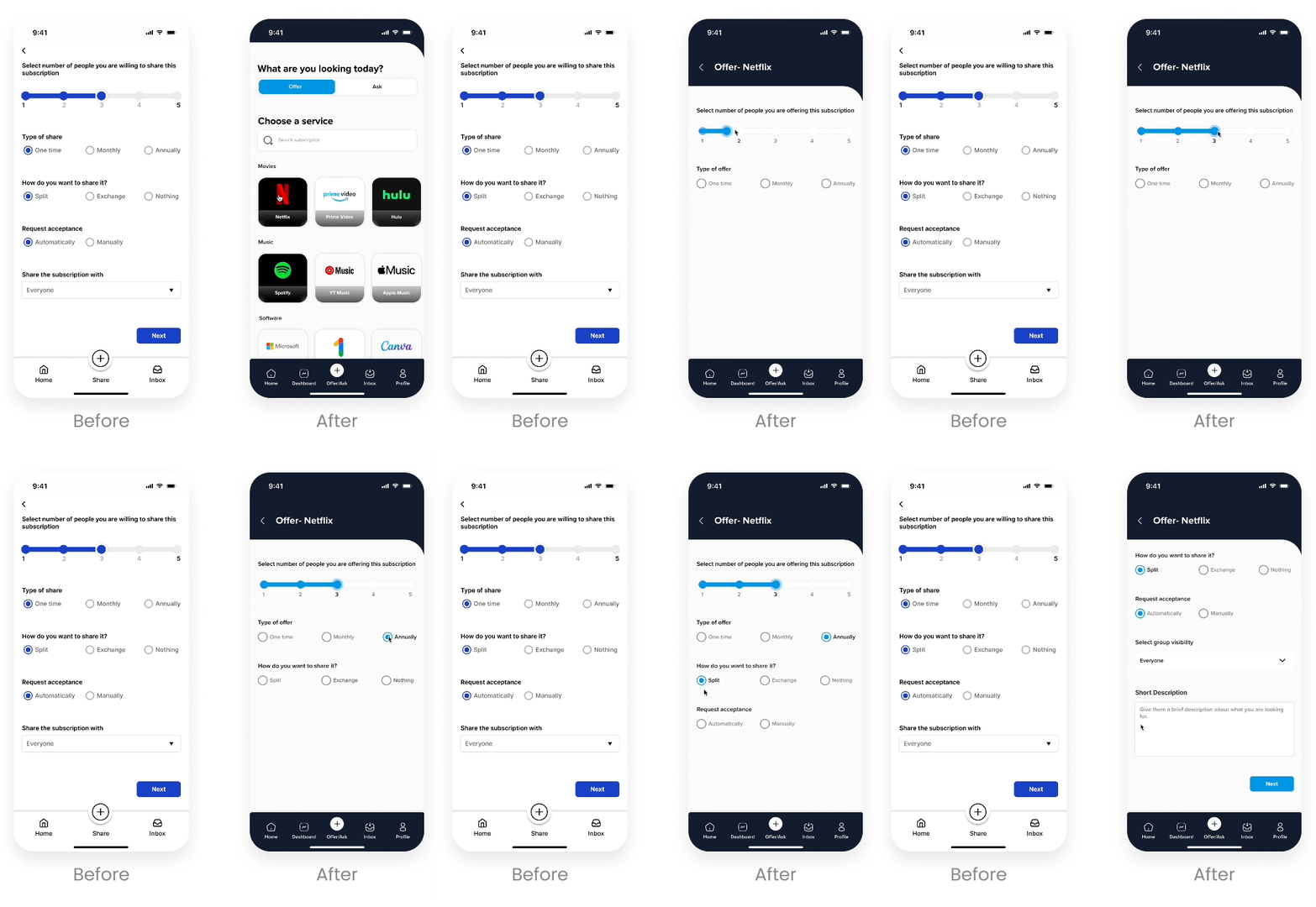
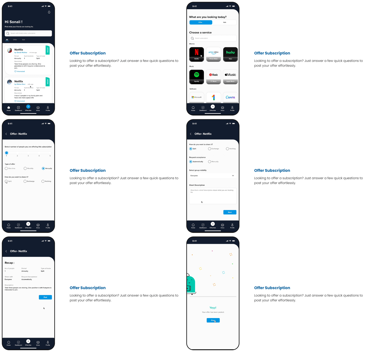
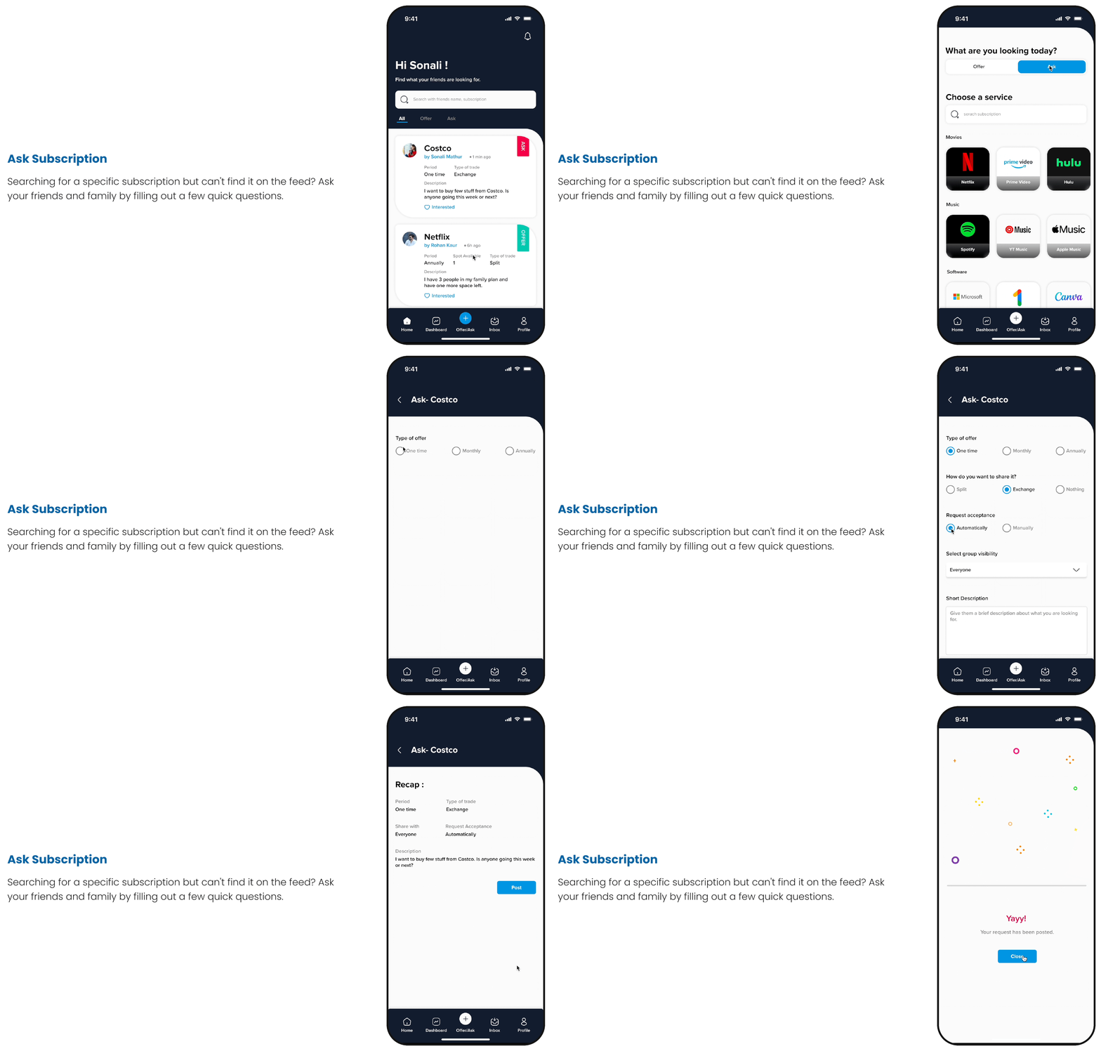
I modified the way questions were presented to users, which previously overwhelmed users by displaying all of them at once. The new approach presents questions one at a time, only showing the next question after the previous one has been answered.
Enhancing Post Readability
Based on user feedback that the old post format was hard to skim through, I introduced a new layout that boosts readability and makes it easier to differentiate between "ask" and "offer" posts.
Design Outcome
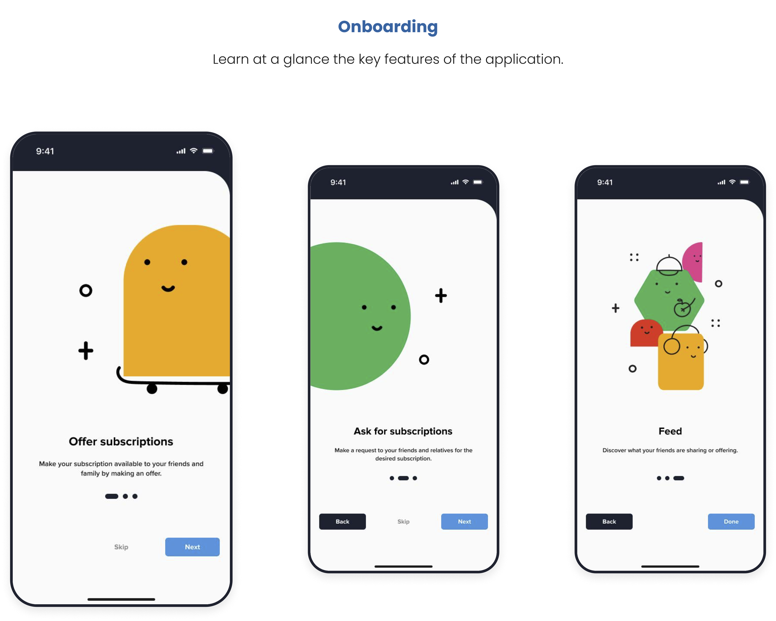
Final Screens
Visual System
Learnings
Early Validation is Crucial: I learned the importance of validating the concept early on, starting with paper prototypes and moving to low-fidelity designs. Testing with potential users at each stage helped avoid costly rework later.
User Feedback Drives Refinement: Continuous feedback from users helped identify not just what worked, but what didn’t, ensuring the final design was both functional and user-friendly.
The Importance of Usability Testing and Iteration: Usability testing revealed that what might feel intuitive to me as a designer can be complex or confusing for others. Iteration based on user feedback helped refine the navigation and design, ensuring a more user-friendly experience.
Trust is Key in Sharing Economies: In designing for a platform based on sharing, I realized how important trust is. Building features that support transparency and reliability helps users feel comfortable exchanging resources, which is essential for sustaining social bonds.
